Tuesday, May 28, 2013

Pastel Still Life Project

To plan my composition I knew I wanted there to be a view of every object I was using and I knew what formation I wanted everything to be in. Before I started any major part of the project I drew a few thumbnail sketchs. A thumbnail sketch is a small quick sketch for a piece of art work. The viewfinder did not help me as much as I expected but it did show me that I wanted to do my pastel horizontally instead of vertically. To make my items appear three dimensional I made colors more dark where the light was not hitting as much and I included white on parts where the light was hitting. To create a light source I made sure I included value so you could see where it was coming from. This project was quite challenging because pastels are hard to work with.

Ceramics Project


To complete my ceramic project we practiced drawing radial designs, soon after we picked out bowls that we wanted our project to take the form of. The medium of my project was clay, and it was quite easy to work with. The size was roughly 11in by 4.5in. The design element that was stressed during the construction was shape, texture, and form. The technique that was used was slab, where you roll it until it is the desirable size. My piece serves as a function, it is used to hold everyday items such as keys, pens, and other things of that nature. To create a design for my project I thought about my skill level and what I would want to create. I learned the stages of clay, how to work with it, and how to make it become the way it is. If I were able to change this project I would not because I like the way it turned out.

Acrylic Landscape Painting

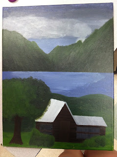
To create my painting I first collected pictures of sky, mountains, cabins, and trees. After collecting photographs I then drew a picture of how my painting would be set up. I needed a sky, background, middle ground, and foreground. I decided to make the sky dark, put the mountains in the background, paint water for the middle ground, and a cabin and trees for the foreground. I made the cabin close to the front of the painting so I could create atmospheric perspective. Atmospheric perspective is how your painting effects the perspective of the atmosphere in the painting. To create light I decided where my light source would be and it is in the top left hand corner. My color scheme for this piece of art work was analogous, which included green, blue green, and blue. I used long and even brush strokes for the mountains, water, and ground. I used somewhat long strokes for the cabin and tree trunks. Then I used scattered brush strokes for the bushes and top of the tree. To create the clouds I used the tops of my fingers and glided them along the paper. To create value in my painting I blended white and black into my colors. After the whole process, my painting turned out better than I anticipated.

Nature Print Project


To begin this project we collected photographs of the animal that we wanted our project to be of. To make this piece of art work we practice techniques to carve into Easy Cut and sketched drawings of what we wanted our print to look like. The utensil we used to carve into the Easy Cut had different sized cutters which created different looking lines. I used the smaller cutters to create the image of the fins and scales. Then I used the medium sized cutters to create the plants. After everything was carved into the Easy Cut we rolled certain colors of paint onto the Easy Cut and layed it on a piece of paper. Then we would rub the paper on the Easy Cut to make sure the paint was distributed evenly. To create this print, I combined the colors pink and purple. The paint did not seep into the cuts in the Easy Cut, so a perfect image was created.

Escher Two Point Perspective Drawing

Leading up to this piece of art work, we practiced with 2 and 3 point perspective. To come up with my idea for my drawing it took creativity and imagination. To make the drawing more real, I used value by shading certain parts of the buildings and hands. To find out what areas to shade I chose an area where the light source would be, which was in the top left hand corner. In order to make the hands the way they are I sketched them out on scrap pieces of paper while looking at pictures of hands. It took me a while to figure out the position of the hands but with the practice I had, they came out better than I expected them to be. I also thought of how to position the buildings, I decided to make them all different heights so there would be some contrast. Overall my drawing came together after all the brainstorming, sketching, and erasing.